Add the widget
Add the widget to the canvas
To access and use a widget:
In Elementor Editor, click +.
All available widgets are displayed.Click or drag the widget to the canvas. For more information, see Add elements to a page.
What is the Search widget?
The Search widget lets your visitors search your site so they can quickly find the products, services or people they need.
When visitors use the search widget, the results are displayed using a Search Results template so you must have a Search Results template in order to use this widget. For details, see Customize the Search Results Archive.
The search widget also offers the option of offering visitors immediate results in addition to the results displayed in the Search Results template. Using this option means that visitors will start seeing search results as soon as they start entering text in the search box. In order to use the immediate search results option, you must create a Loop item which will display the search results. For more information on Loop Items, see Loop Grid widget.
Common use case
Jan is building a website for a jewelry store. They want to make it easier for customers to search for items in their webstore so they add a search bar to the header.

Adding a Search widget: Step-by-step
Search widgets are often used in the site’s header. In this example we’ll add a search widget to the header of an online jewelry store. In addition, we want users to get immediate results when they start searching, so we’ll add a Loop Item to display the results. Since most themes come with a Search Results Archive, we’ll assume this site has one.
Create a Loop Item
First we’ll create the Loop Item:
- From WP Admin, navigate to the Theme Builder.
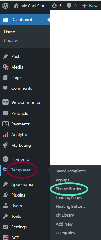
You must create the Loop Item using the Theme Builder.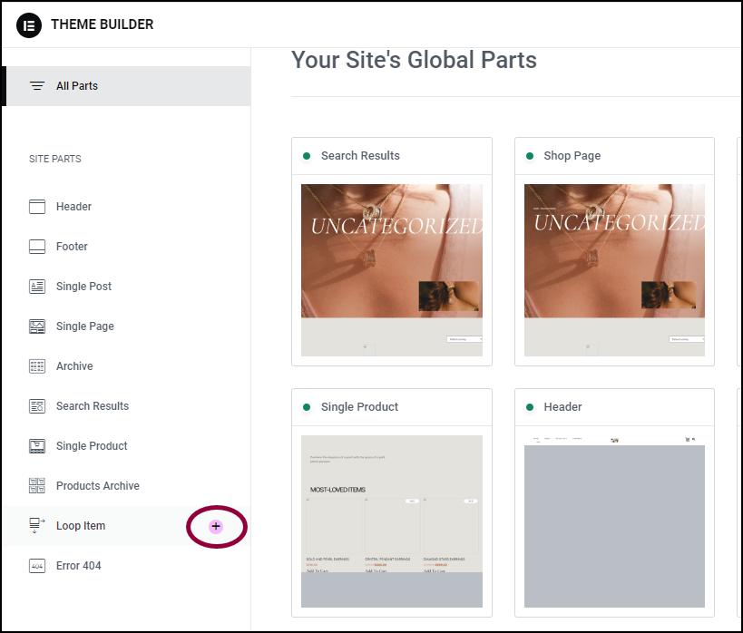
- In the panel, click the + sign next to Loop Item.
To keep things simple, we’ll use one of the Loop Item templates, but you can create your own Loop Item if you prefer.
- Hover over the template and click Insert.
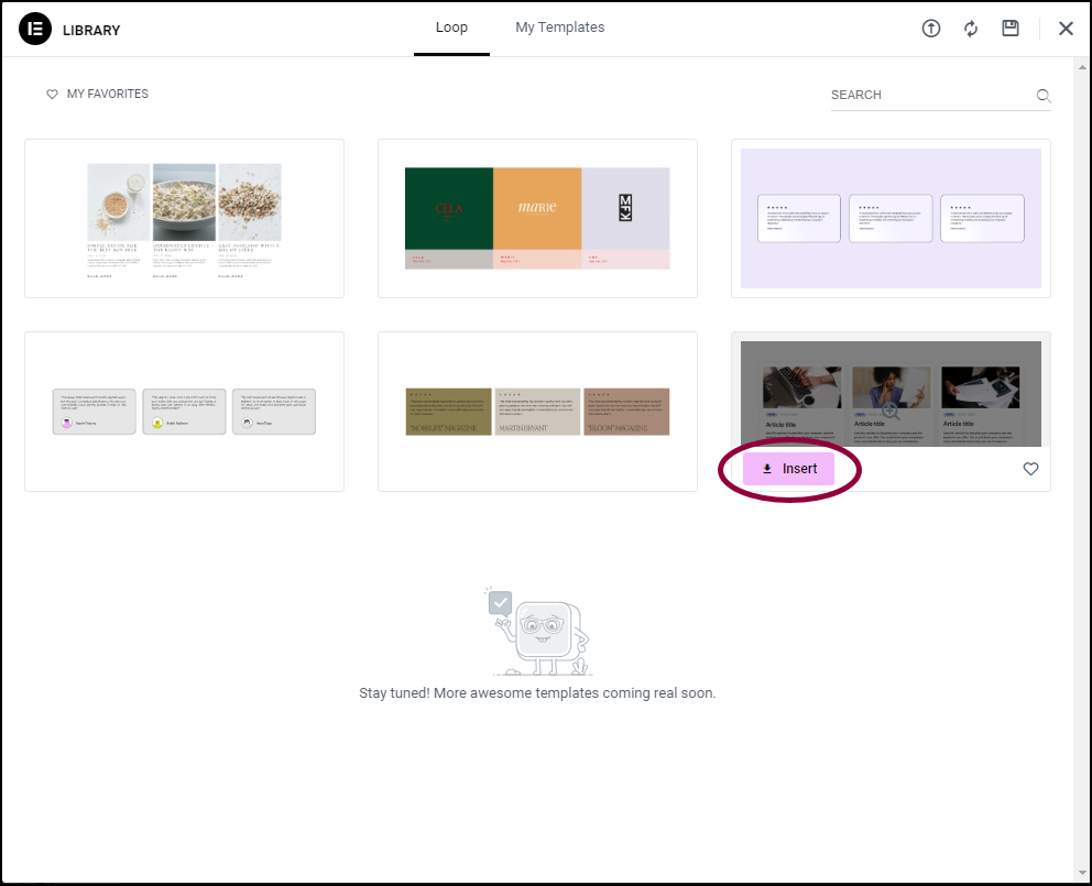
The live search results will appear in this item.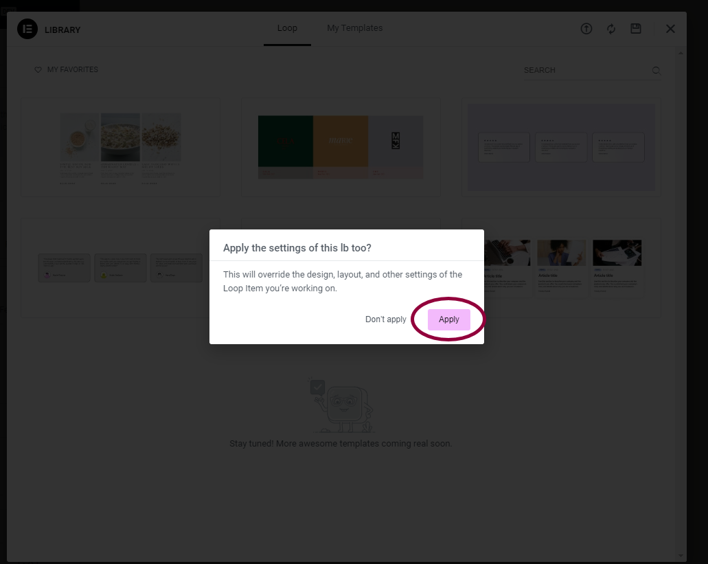
- In the popup, click Apply.
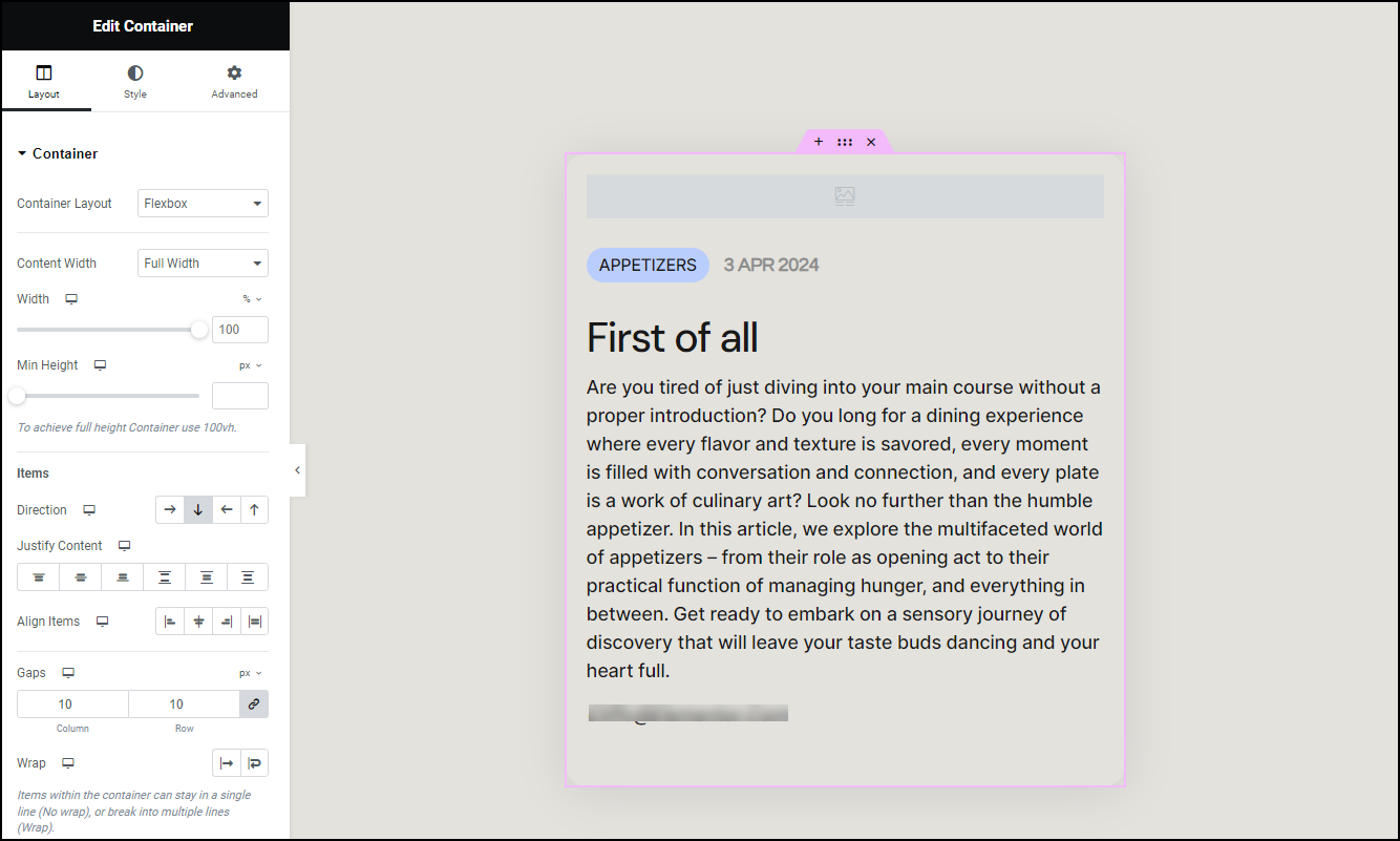
The Loop Item appears on the canvas.![]()
- In the top toolbar, click the Page Settings icon.
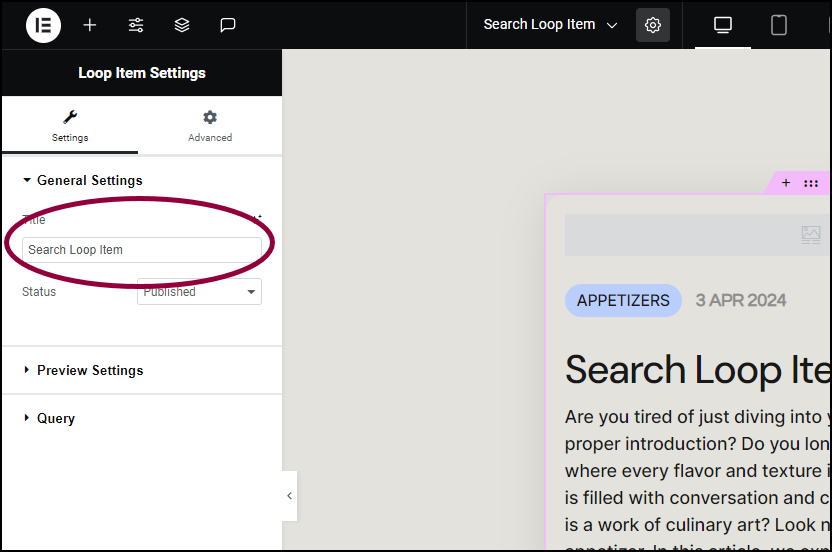
- In the panel, in the Title field, rename the Loop Item Search Loop Item.

- In the upper right, click Publish.
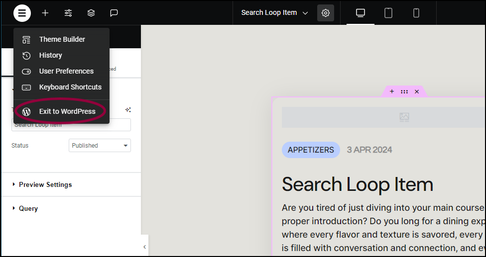
- In the left side of the top bar, click the Elementor Logo and exit to WP Admin.
- Return to the Theme Builder.
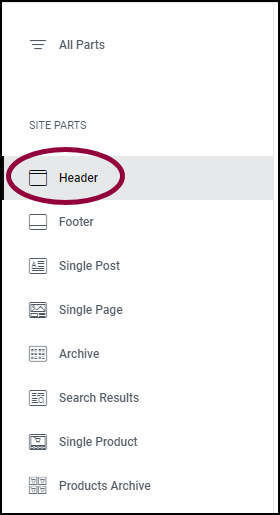
- In the panel, click Header.
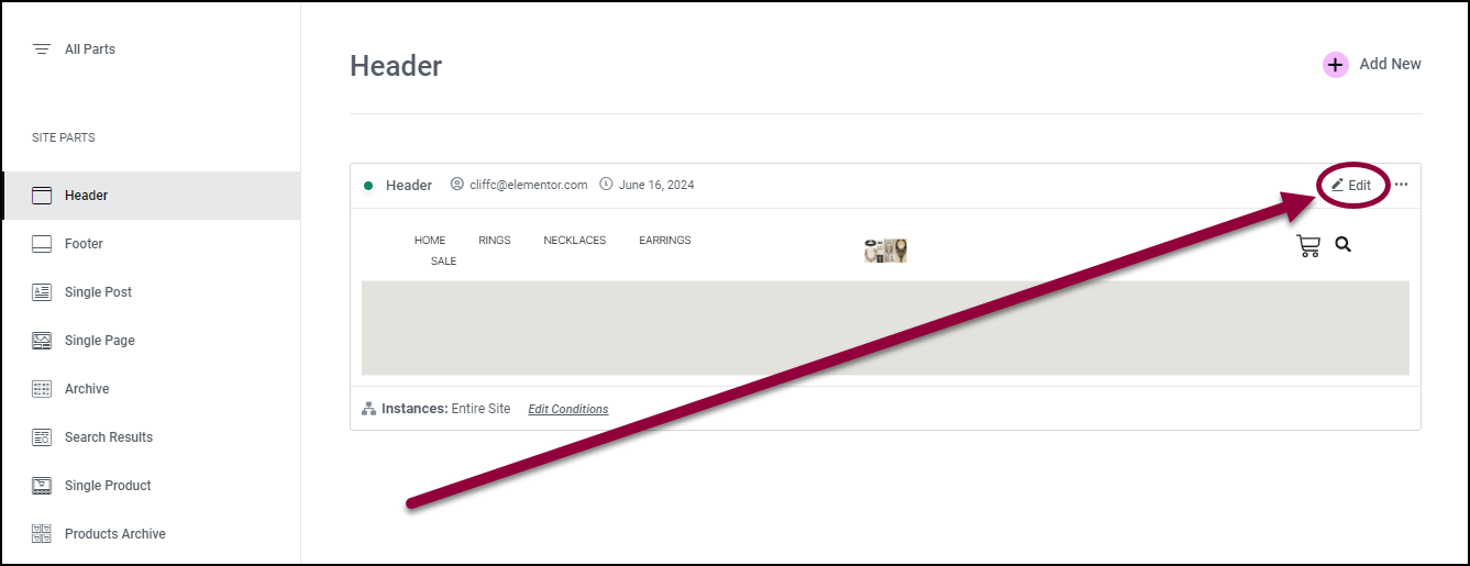
- In the right pane, click Edit.
The Elementor Editor opens with the Header in the canvas.
Add the search widget
- Add a Search widget to the Header in the canvas. For details, see Add elements to a page.
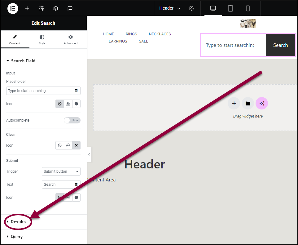
- In the panel, open the Results section.
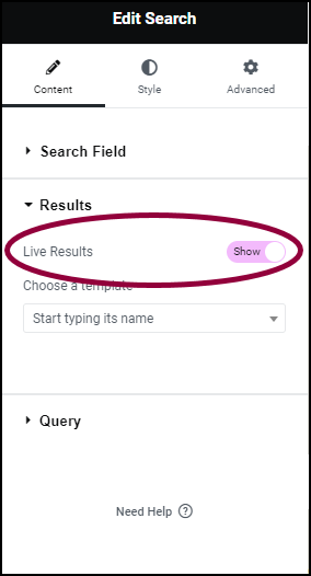
- In the panel, toggle Live Results to Show.
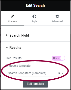
The Choose a template dropdown menu appears. - Use the Choose a template dropdown to select the Search Loop Item template.
Adjust the results
Right now the live results are set to display in one column. That’s good for mobile, but doesn’t look so nice on a PC.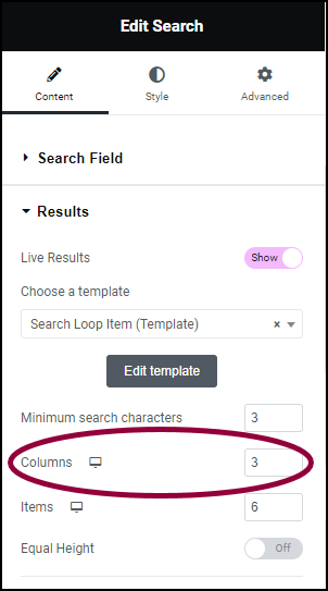
- In the Columns field, enter 3.
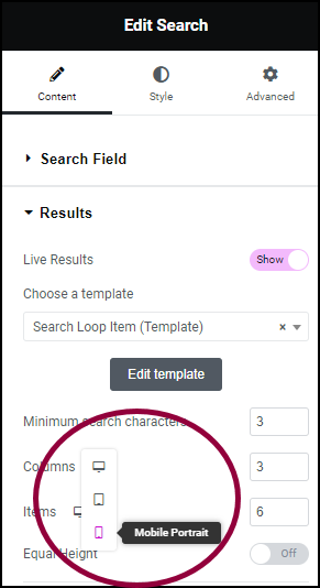
- Use the responsive icons to switch to mobile editing. For details about mobile editing, see Responsive Design.
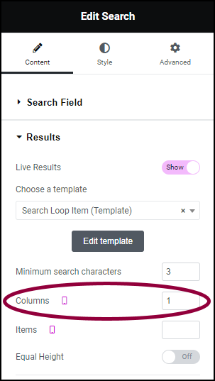
- In the Columns field, enter 1.
The live results will display as three columns on a PC and one column on mobile.
- On the right site of the search bar, click Publish.
Settings for the Search form widget
You can customize your widgets using content, style, and other advanced parameters, offering you great flexibility in tailoring them to your needs. Click the tabs below to see all the settings available for this widget.
Content tab
Add, delete, and edit menu items and controls.
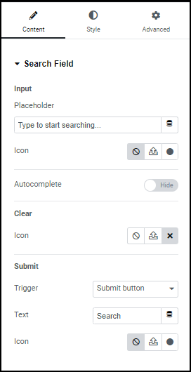
Input
- Placeholder: Text that appears in the search box by default.
- Icon: You have the option of adding an icon to the search box. For details, see Adding images and icons.
- Autocomplete: Toggle to Show if you want your site to offer potential search terms as visitors are entering text into the search box.
Clear
Icon: Select an icon that appears in the search bar. Clicking this icon deletes all text in the search box. You can elect to have no icon. For details, see Adding images and icons
Submit
- Trigger: The action that will start the search. Use the dropdown menu to select:
- Submit button
- Enter key
- Both
- Text: The text that appears on the Submit button, if you use a submit button.
- Icon: Add an icon to the submit button. This icon can be instead of or in addition to the text. For details, see Adding images and icons.
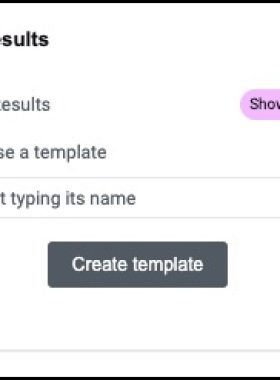
Live Results
Live Results: Toggle to Show if you want the search widget to display search results as the visitor is entering search text.
If you want to display live search results, you must create a Loop Item to display the results.
Choose a template
If you already have a Loop item template to display the live search results, enter it here.
If you don’t have a Loop item template ready, click Create Template to create a Loop item.
If you already have a Loop item ready to display the live search results, the Create template button will change to Edit template.
If you want to display live search results, you must create a Loop Item to display the results.
Query
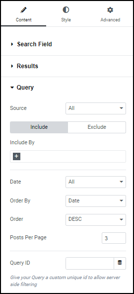
Query allows you to limit what type of content the search results will display.
- Source: Use the dropdown to restrict your search to the following types of content:
- Products
- Posts
- Pages
- Landing Pages
- Floating Buttons
- Include: Click include to build a query defining the items you want in your Loop Grid
- Exclude: Click include to build a query defining the items you want in your Loop Grid
- Include By/Exclude By: Use the text box to enter the types of posts you want to include or exclude.
- Date: se the dropdown menu to include or exclude items according to when they were created
- Order By: Use the dropdown menu to determine the criteria for arranging the loop items.
- Order: Use the dropdown menu set whether the loop items will be arranged in:
- DESC: In descending order
- ASC: In ascending order
- Posts Per Page: Set how many items will appear per page in your search results.
- Query ID: Use the dropdown menu to include or exclude items according to when they were created.
For an example of query building, see Build a query with the loop grid.
Style tab
Determine the look and feel of menu items and controls.
Search Field
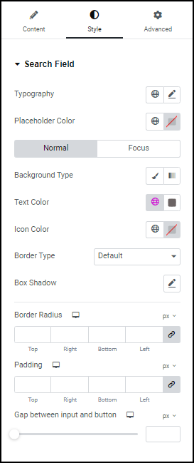
Control the look and feel of the text visitors enter in the text box:
- Typography – Choose the font and size of the text in the search box. For details, see Typography.
- Placeholder Color: Choose a color for the default text in the search box. For details, see Choose a color or Use global fonts and colors
- Normal: How the text appears by default
- Focus: How the text appears when the search box is selected.
- Background Type: Select a background for the search box. For details, see Create a Background.
- Text Color: Set the color of the text entered by visitors. For details, see Choose a color or Use global fonts and colors.
- Icon Color: Set the color of the icon in the submit button. For details, see Choose a color or Use global fonts and colors.
- Border Type: Use the dropdown menu to add a border around the search box. If you add a border, you can add a Border Color and Border Width.
- Border Color: Select a color for the border of the search box. For details, see Choose a color or Use global fonts and colors.
- Box Shadow: Give the search box more depth by adding a shadow. For details, see, What is Shadow?
- Border Radius: Round the edges of the text box by adding a border radius. For details, see Border radius tools.
- Padding: For more details, see Padding and margins.
- Gap between input and button: Control the size of the search box by increasing the gap between the box and the submit button.
Clear
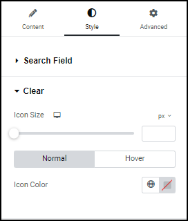
Control the look and feel of the clear icon found in the search box, if you use a clear icon.
- Icon Size: Set the size for search icon.
- Normal: The default setting for the icon or text
- Hover: The settings for the icon or text when a visitors mouses over them.
- Icon Color (for buttons that contain text): Set a color for the text in the button.
Input
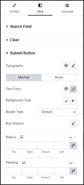
Control the look and feel of the submit button:
- Typography: Set the font and size of the text in the submit button. For details, see Typography.
- Normal: How the text appears by default
- Hover: How the text appears when the visitor mouses over the submit button.
- Text Color: Set the color of the text in the submit button. For details, see Choose a color or Use global fonts and colors.
- Background Type: Select a background for the submit button. For details, see Create a Background.
- Border Type: Use the dropdown menu to add a border around the submit button. If you add a border, you can add a Border Color and Border Width.
- Box Shadow: Give the submit button more depth by adding a shadow. For details, see, What is Shadow?
- Radius: Round the edges of the text box by adding a border radius. For details, see Border radius tools.
- Padding: For more details, see Padding and margins.
Background type
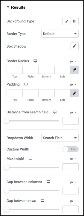
Add a background to the search results. For details, see Create a Background.
Border type
Border Type: Use the dropdown menu to add a border around the search results. If you add a border, you can add a Border Color and Border Width.
Box Shadow
Box Shadow: Give the search results more depth by adding a shadow. For details, see, What is Shadow?
Border Radius
Border Radius: Round the edges of the search results by adding a border radius. For details, see Border radius tools.
Padding
Padding: Add padding to the search results. For more details, see Padding and margins.
Distance from search field
Use the slider to determine how far the results will appear under the search bar.
Dropdown Width
Use the dropdown menu to select how far across the screen the search results will be displayed:
- Search Field: The results will be displayed over an area as wide as the search box where visitors enter their search terms.
- Widget Width: The results will be displayed over an area as wide as the entire Search widget.
You will still be able to set a custom width for the results.
Custom Width
Use the slider to determine how far across the screen the results will be displayed.
Max Height
Use the slider to determine the height of the search results.
Gap between columns
Search results are usually displayed in multiple columns. Use the slider to determine how far apart these columns will be displayed.
Gap between rows
Search results are usually displayed in multiple rows. Use the slider to determine how far apart these rows will be displayed.
Advanced tab
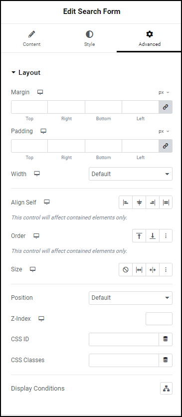
Control the placement of your widget, insert links, add custom code and more.
Advanced
Learn more about the Advanced tab settings.